Site mobile navigation

  • Home
  • Visualizations
  • About
    • What is Money?
    • About the Money Project
  • Subscribe
  • Contact Us
Skip to content
Menu

Top navigation

The Money Project

The Money Project The Money Project

Site navigation

  • Home
  • Visualizations
    • All of the World’s Money and Markets in One VisualizationAll of the World’s Money and Markets in One Visualization
    • From Richer to Poorer: Venezuela’s Economic Tragedy VisualizedFrom Richer to Poorer: Venezuela’s Economic Tragedy Visualized
    • The Richest People in Human History (Part 1)The Richest People in Human History (Part 1)
    • 38 Incredible Facts on the Modern U.S. Dollar38 Incredible Facts on the Modern U.S. Dollar
    • 31 Fascinating Facts on the Early History of the U.S. Dollar31 Fascinating Facts on the Early History of the U.S. Dollar
  • About
    • What is Money?
    • About the Money Project
  • Subscribe
  • Contact Us
  • Home
  • All

All

AllData Visualization

All of the World’s Money and Markets in One Visualization

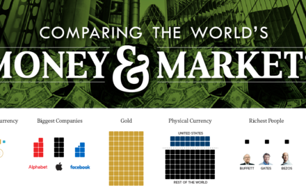
How much money exists in the world? This updated visualization compares the world’s richest people, companies, and markets with the world’s money supply.

By Jeff DesjardinsOctober 26, 2017October 26, 2017
0
AllInfographic

From Richer to Poorer: Venezuela’s Economic Tragedy Visualized

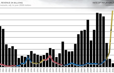
These charts give context on today’s crisis in Venezuela from a historical perspective, showing how the country fell from being one of the world’s richest.

By Jeff DesjardinsSeptember 5, 2017September 5, 2017
0
AllInfographic

The Richest People in Human History (Part 1)

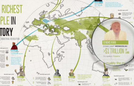
What do Augustus Caesar, Cosimo de Medici, Mansa Musa, and Genghis Khan have in common? They were some of the richest people in all of history.

By Jeff DesjardinsJuly 27, 2017July 29, 2017
0
AllInfographic

38 Incredible Facts on the Modern U.S. Dollar

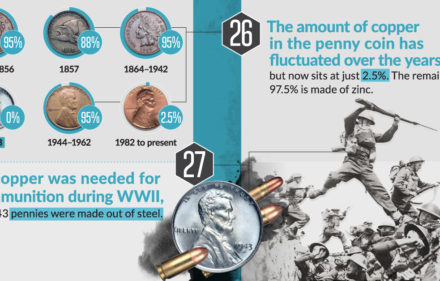
How much currency is printed each year? How long do bills last? Learn 38 facts on the modern U.S. dollar in this infographic.

By Jeff DesjardinsJune 27, 2017June 27, 2017
0
AllInfographic

31 Fascinating Facts on the Early History of the U.S. Dollar

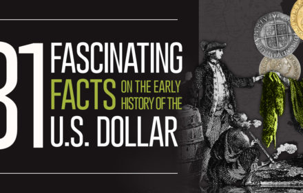
Today, the U.S. dollar is an iconic currency familiar to all. But do you know the history of U.S. currency, and events that shaped the dollar we know today?

By Jeff DesjardinsMay 16, 2017May 16, 2017
0
AllInfographic

The Buying Power of the U.S. Dollar Over the Last Century

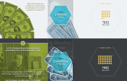
A timeline of U.S. monetary history shows the major events, the changing money supply, and the falling buying power of the U.S. dollar over time.

By Jeff DesjardinsApril 5, 2017April 5, 2017
0
AllInfographic

13 Stunning Visualizations of Silver Put Global Debt Into Perspective

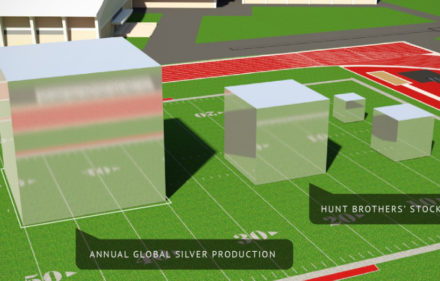
What does the average paycheck look like in silver? What about all of global debt? Find out with these breathtaking 3d visualizations.

By Jeff DesjardinsMarch 9, 2017March 10, 2017
0
AllInfographic

11 Stunning Visualizations of Gold Show Its Value and Rarity

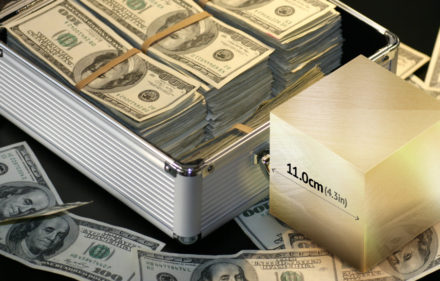
Gold packs a high amount of value in a tiny package – and these gold cube visualizations help put the value and extreme rarity of gold in perspective.

By Jeff DesjardinsFebruary 16, 2017February 28, 2017
0
AllInfographic

The Global War on Cash

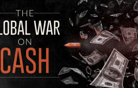
A global push by lawmakers to eliminate the use of physical cash is accelerating. See who’s getting targeted in the War on Cash, and who’s in the crossfire.

By Jeff DesjardinsJanuary 18, 2017February 1, 2017
0
AllMotion Graphic

Video: Donald Trump’s $20 Trillion Problem

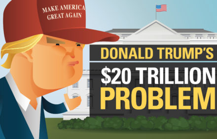
The incoming president faces many pressing issues – but for many, one looms above all others: how will President Trump deal with the $20 trillion national debt?

By Jeff DesjardinsJanuary 12, 2017January 12, 2017
0
AllData Visualization

Bitcoin: The Top Performing Currency For a Second Year in a Row

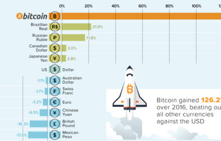
Bitcoin is no stranger to extremes: in each of the last four years, it has been either the best or worst performing currency, with nothing in between.

By Jeff DesjardinsJanuary 3, 2017January 3, 2017
0
AllInfographic

Descend Into The World’s Deepest Gold Mine

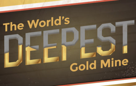
How far are humans willing to go to unearth gold? Take a 2.5 mile journey into the world’s deepest gold mine, found in the richest gold region on Earth.

By Jeff DesjardinsDecember 8, 2016December 8, 2016
0
AllInfographic

Demystifying the Chinese Yuan

China’s currency tightrope: it desperately wants to legitimize the Chinese yuan, but at the same time needs to manipulate its currency to achieve growth.

By Jeff DesjardinsNovember 3, 2016November 3, 2016
0
AllMotion Graphic

How Much Money Have Humans Created?

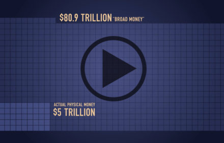
It’s so much, that just telling you wouldn’t convey the magnitude. That’s why we created this video, which visualizes all money and markets in context.

By Jeff DesjardinsSeptember 28, 2016October 3, 2016
0
AllData Visualization

Visualizing the Size of the U.S. National Debt

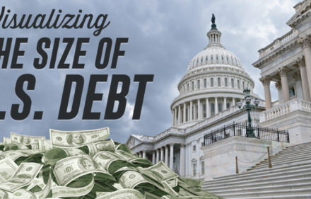
How big is $19.5 trillion, really? This infographic visualizes the U.S. national debt in comparison to other numbers that might be more familiar.

By Jeff DesjardinsSeptember 8, 2016September 17, 2016
0
AllMotion Graphic

Donald Trump’s Entire Financial History in One Short Video

How did Donald Trump get to be worth billions? See the details of his successes and failures, his family’s surprising past, and the help he got along the way.

By Jeff DesjardinsJune 23, 2016June 23, 2016
0
AllData Visualization

The Trajectory of Venezuelan Hyperinflation Looks Familiar…

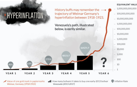
Does the chart for the Venezuelan bolivar look eerily familiar? Get a full perspective on Venezuelan hyperinflation with these two important visualizations.

By Jeff DesjardinsJune 15, 2016January 18, 2017
0
AllInfographic

Visualizing the Most Miserable Countries in the World

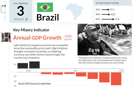
This lengthy infographic counts down the 10 most miserable countries in the world based on key economic factors such as inflation, growth, and unemployment.

By Jeff DesjardinsMay 10, 2016May 10, 2016
0
AllData Visualization

Visualizing The World’s Top 50 Wealthiest Billionaires

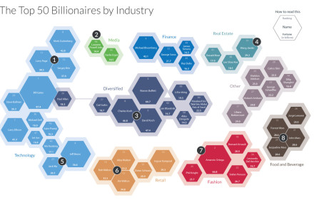
This stunning data visualization breaks down the top 50 wealthiest billionaires by industry, age, country, as well as the size of their fortunes.

By Jeff DesjardinsMarch 30, 2016March 30, 2016
0
AllData Visualization

Chart: Deaths of Roman Emperors vs. Coinage Debasement

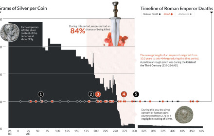
This data visualization plots the causes of death of Roman Emperors against the content of silver coins.

By Jeff DesjardinsMarch 17, 2016March 17, 2016
0
AllInfographic

Life and Times During the Great Depression

Banks collapsed, and millions were out of work. This infographic, part 2 of 2, details the extent of The Great Depression as well as the deflationary cycle.

By Jeff DesjardinsMarch 10, 2016March 10, 2016
0
AllInfographic

Currency and the Collapse of the Roman Empire

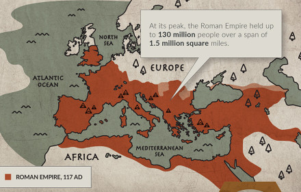
How currency debasement, soaring costs, and overtaxing helped lead to the collapse of Ancient Rome’s economy and empire.

By Jeff DesjardinsFebruary 18, 2016February 18, 2016
0
AllData Visualization

All of the World’s Stock Exchanges by Size

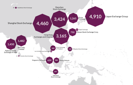
There’s 60 major stock exchanges in the world, ranging from the mighty NYSE to the tiny Bermuda stock market. Here they all are visualized by size and location.

By Jeff DesjardinsFebruary 16, 2016February 16, 2016
0
AllInfographic

The World’s Most Famous Case of Deflation (Part 1 of 2)

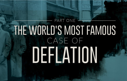
The Great Depression was the most severe economic depression ever experienced by the Western world. During this time was also the most famous case of deflation.

By Jeff DesjardinsFebruary 4, 2016February 4, 2016
0
AllInfographic

The World’s Most Famous Case of Hyperinflation (Part 2 of 2)

The continuation of our story on Germany’s bout with hyperinflation in the early 1920s. We look at the effects, as well as even worse stories of inflation.

By Jeff DesjardinsJanuary 20, 2016January 20, 2016
0
AllInfographic

The World’s Most Famous Case of Hyperinflation (Part 1 of 2)

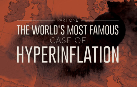
Hyperinflation has happened hundreds of times throughout history, but today we present the origins of the world’s most famous case in Germany after WW1.

By Jeff DesjardinsJanuary 14, 2016January 20, 2016
0
AllInfographic

It’s Official: Bitcoin was the Top Performing Currency of 2015

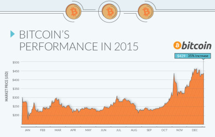
Despite the strength of the U.S. dollar, it was the world’s best-known cryptocurrency, Bitcoin, that was the top performing currency of 2015.

By Jeff DesjardinsJanuary 5, 2016January 5, 2016
0
AllInfographic

Infographic: The World’s Strangest Currencies

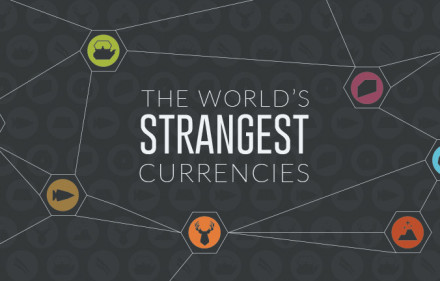
For centuries, humans from all around the world have tried to use different things as money. Here are some of the world’s strangest currencies used so far.

By Jeff DesjardinsDecember 22, 2015December 22, 2015
0
AllData Visualization

All of the World’s Money and Markets in One Visualization

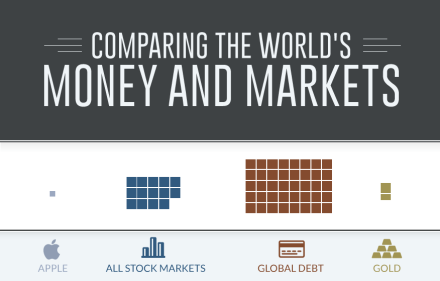
How much money is there in the world? This visualization compares the world’s richest people, companies, and stock markets with the world’s money supply.

By Jeff DesjardinsDecember 17, 2015December 18, 2015
0
AllInfographic

Infographic: The Properties of Money

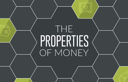
Most economists agree on the properties of money. For example, money is a store of value, a unit of account, and a medium of exchange.

By Jeff DesjardinsDecember 15, 2015December 17, 2015
0
AllInfographic

Infographic: What is Money?

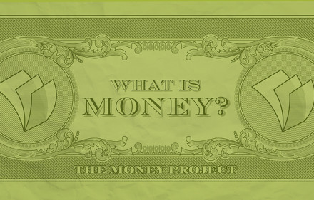
At first glance, the concept of money seems simple. But what is money when we really dive deep? The Money Project explores the concept of money itself.

By Jeff DesjardinsDecember 15, 2015December 15, 2015
0
Doing business the Texas way.

About the Money Project

The Money Project uses rich visuals to explore the concept and implications of money.

Founding Partners

Visual CapitalistTexas Precious Metals

Connect With Us

Copyright © 2015 Visual Capitalist | All rights reserved.

Subscribe to get daily visuals on money and investing.

Subscribe