Site mobile navigation

  • Home
  • Visualizations
  • About
    • What is Money?
    • About the Money Project
  • Subscribe
  • Contact Us
Skip to content
Menu

Top navigation

The Money Project

The Money Project The Money Project

Site navigation

  • Home
  • Visualizations
    • All of the World’s Money and Markets in One VisualizationAll of the World’s Money and Markets in One Visualization
    • From Richer to Poorer: Venezuela’s Economic Tragedy VisualizedFrom Richer to Poorer: Venezuela’s Economic Tragedy Visualized
    • The Richest People in Human History (Part 1)The Richest People in Human History (Part 1)
    • 38 Incredible Facts on the Modern U.S. Dollar38 Incredible Facts on the Modern U.S. Dollar
    • 31 Fascinating Facts on the Early History of the U.S. Dollar31 Fascinating Facts on the Early History of the U.S. Dollar
  • About
    • What is Money?
    • About the Money Project
  • Subscribe
  • Contact Us
  • Home
  • Data Visualization

Data Visualization

AllData Visualization

All of the World’s Money and Markets in One Visualization

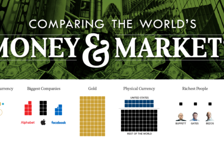
How much money exists in the world? This updated visualization compares the world’s richest people, companies, and markets with the world’s money supply.

By Jeff DesjardinsOctober 26, 2017October 26, 2017
0
AllData Visualization

Bitcoin: The Top Performing Currency For a Second Year in a Row

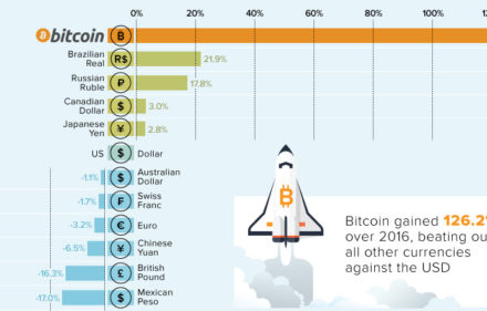
Bitcoin is no stranger to extremes: in each of the last four years, it has been either the best or worst performing currency, with nothing in between.

By Jeff DesjardinsJanuary 3, 2017January 3, 2017
0
AllData Visualization

Visualizing the Size of the U.S. National Debt

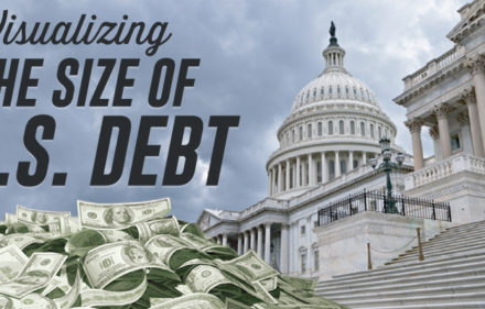
How big is $19.5 trillion, really? This infographic visualizes the U.S. national debt in comparison to other numbers that might be more familiar.

By Jeff DesjardinsSeptember 8, 2016September 17, 2016
0
AllData Visualization

The Trajectory of Venezuelan Hyperinflation Looks Familiar…

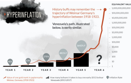
Does the chart for the Venezuelan bolivar look eerily familiar? Get a full perspective on Venezuelan hyperinflation with these two important visualizations.

By Jeff DesjardinsJune 15, 2016January 18, 2017
0
AllData Visualization

Visualizing The World’s Top 50 Wealthiest Billionaires

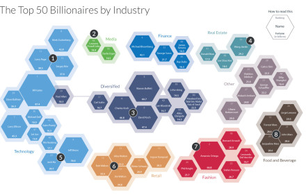
This stunning data visualization breaks down the top 50 wealthiest billionaires by industry, age, country, as well as the size of their fortunes.

By Jeff DesjardinsMarch 30, 2016March 30, 2016
0
AllData Visualization

Chart: Deaths of Roman Emperors vs. Coinage Debasement

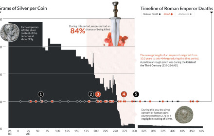
This data visualization plots the causes of death of Roman Emperors against the content of silver coins.

By Jeff DesjardinsMarch 17, 2016March 17, 2016
0
AllData Visualization

All of the World’s Stock Exchanges by Size

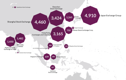
There’s 60 major stock exchanges in the world, ranging from the mighty NYSE to the tiny Bermuda stock market. Here they all are visualized by size and location.

By Jeff DesjardinsFebruary 16, 2016February 16, 2016
0
AllData Visualization

All of the World’s Money and Markets in One Visualization

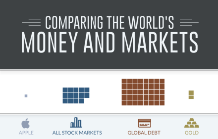
How much money is there in the world? This visualization compares the world’s richest people, companies, and stock markets with the world’s money supply.

By Jeff DesjardinsDecember 17, 2015December 18, 2015
0
Doing business the Texas way.

About the Money Project

The Money Project uses rich visuals to explore the concept and implications of money.

Founding Partners

Visual CapitalistTexas Precious Metals

Connect With Us

Copyright © 2015 Visual Capitalist | All rights reserved.

Subscribe to get daily visuals on money and investing.

Subscribe