All of the World's Money and Markets in One Visualization (2017 Update)

All of the World’s Money and Markets in One Visualization

Enjoy this graphic? You can also find it in our new infographic book – it’s available until Oct 31st, 2017 on Kickstarter.

Millions, billions, and trillions…

When we talk about the giant size of Apple, the fortune of Warren Buffett, or the massive amount of global debt accumulated – all of these things sound large, but they are actually extremely different in magnitude.

That’s why visualizing things spatially can give us a better perspective on money and markets.

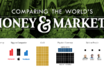
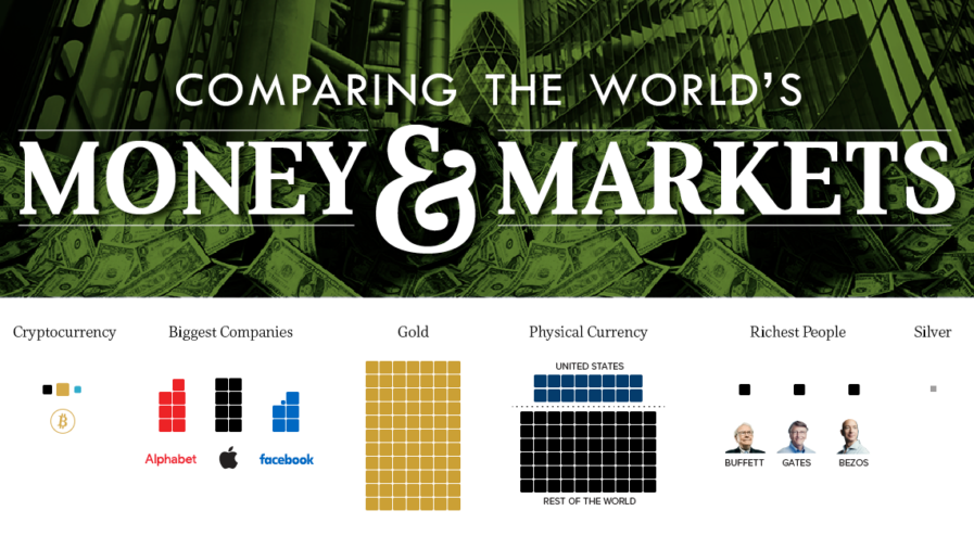
How Much Money Exists?

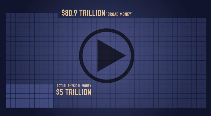
This infographic was initially created to show how much money exists in its different forms. For example, to highlight how much physical cash there is in comparison to broader measures of money which include saving and checking account deposits.

Interestingly, what is considered “money” depends on who you are asking.

Are the abstractions created by Central Banks really money? What about gold, bitcoins, or other hard assets?

A New Meaning

However, since we first released this infographic in 2015, “All the World’s Money and Markets” has taken on a different meaning to us and many others. It’s a way of simplifying a complex universe of currencies, assets, and other financial instruments in a way that people can understand.

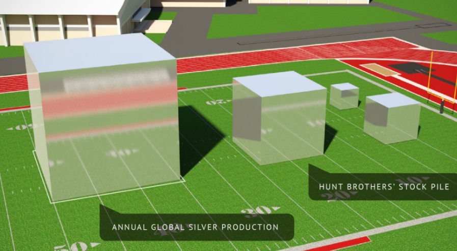
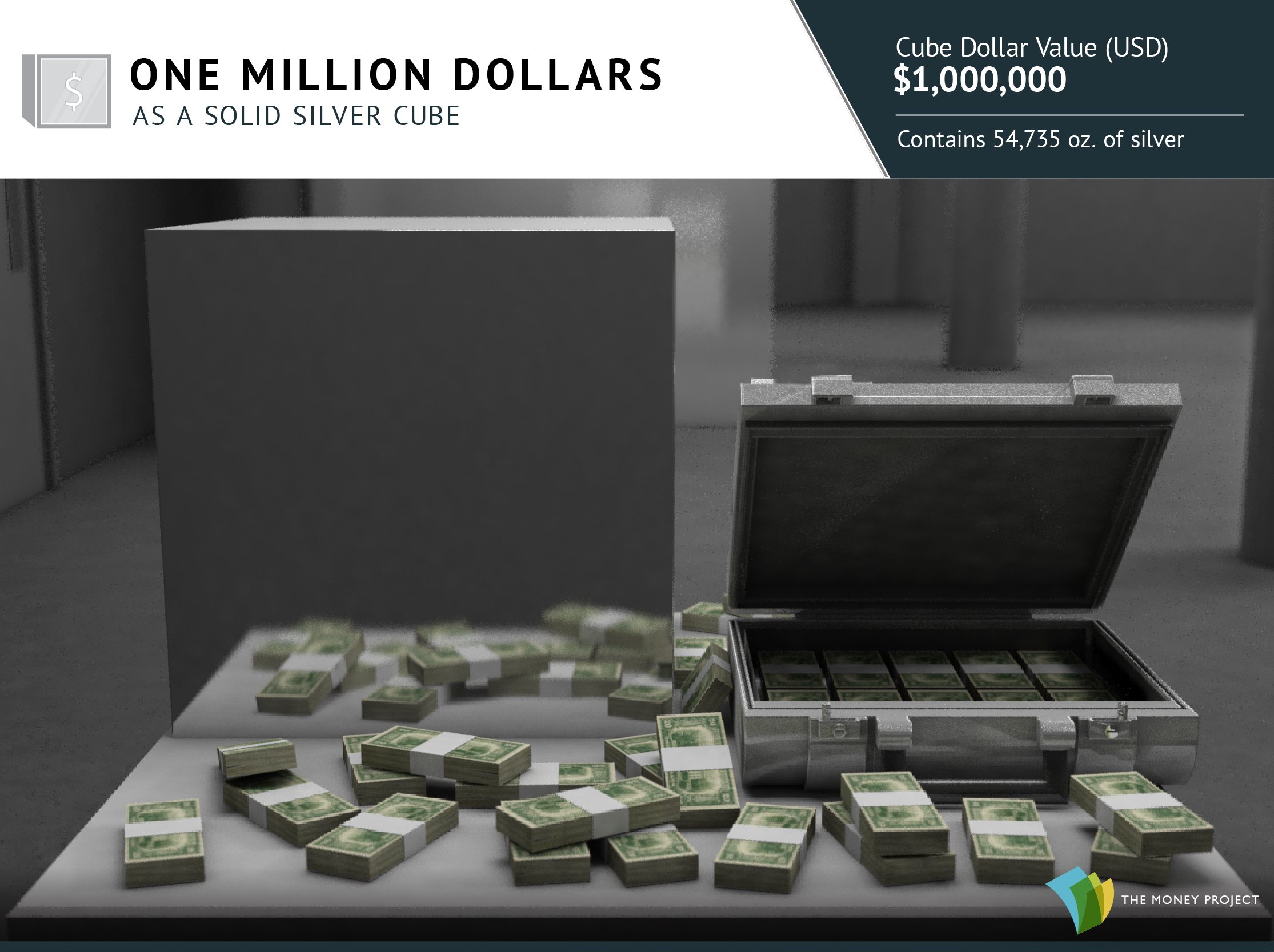
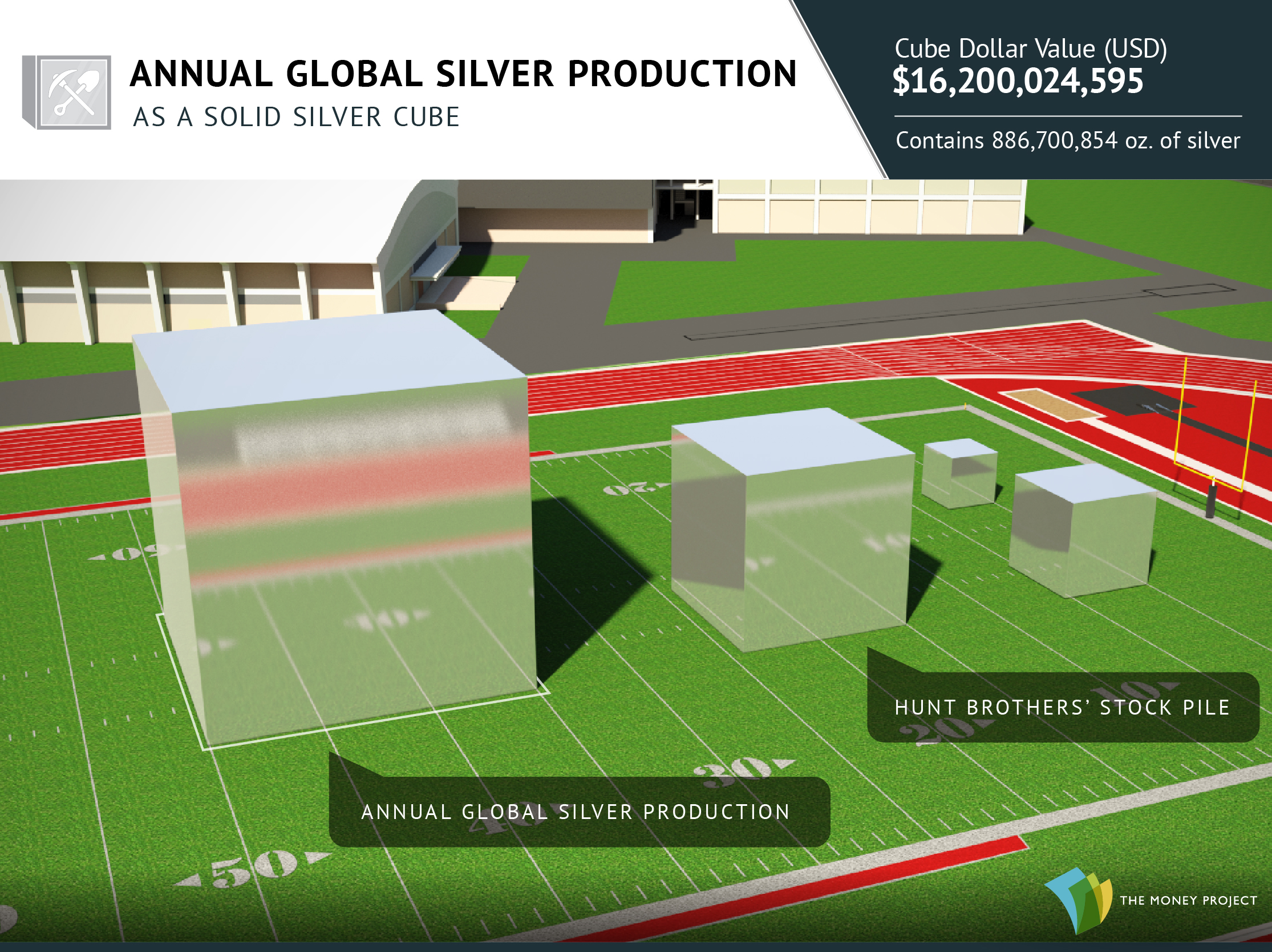
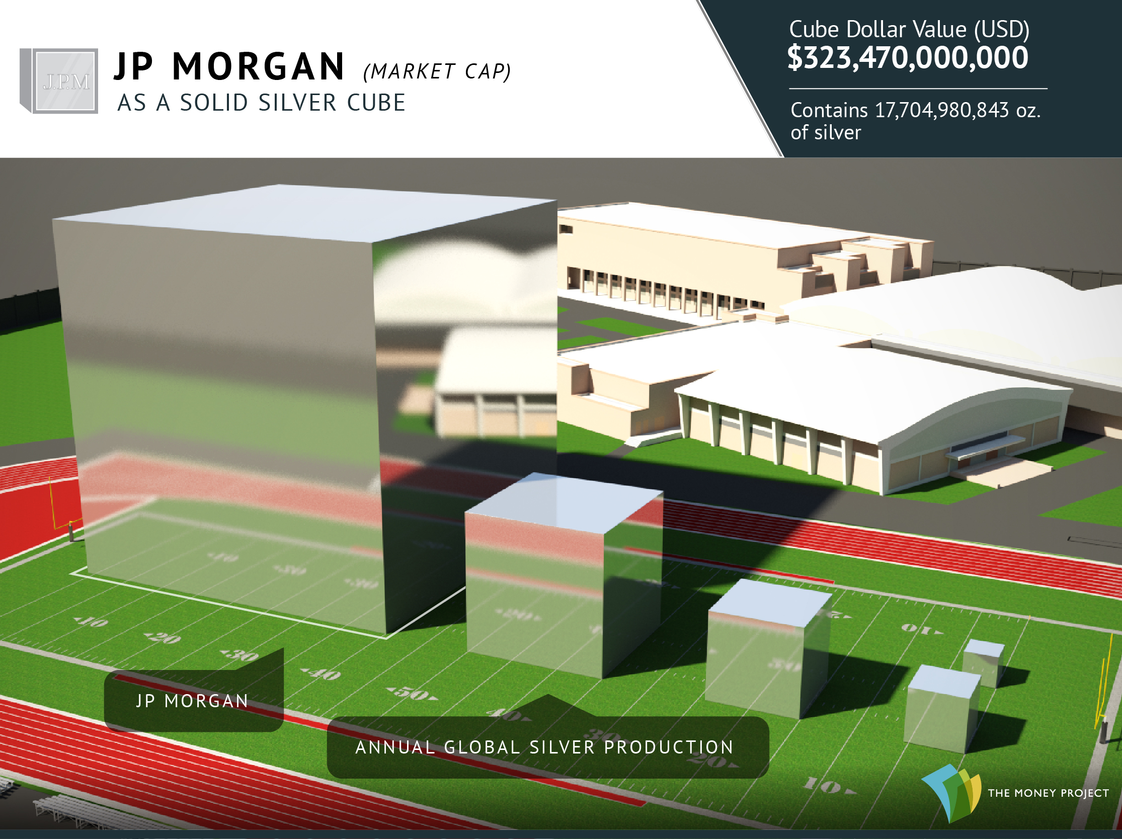
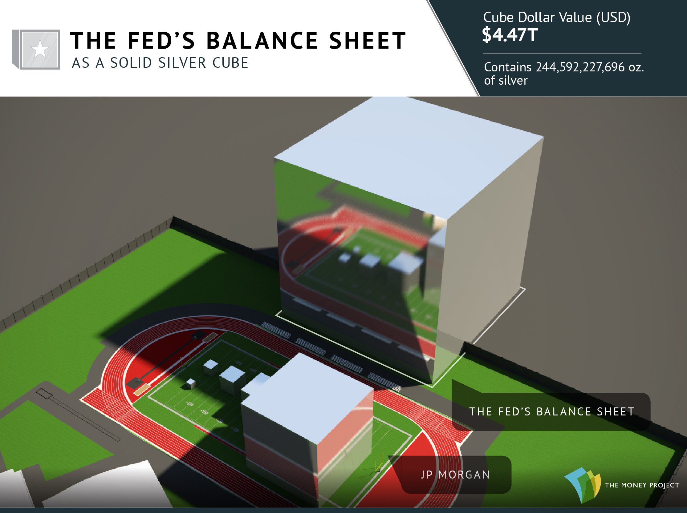
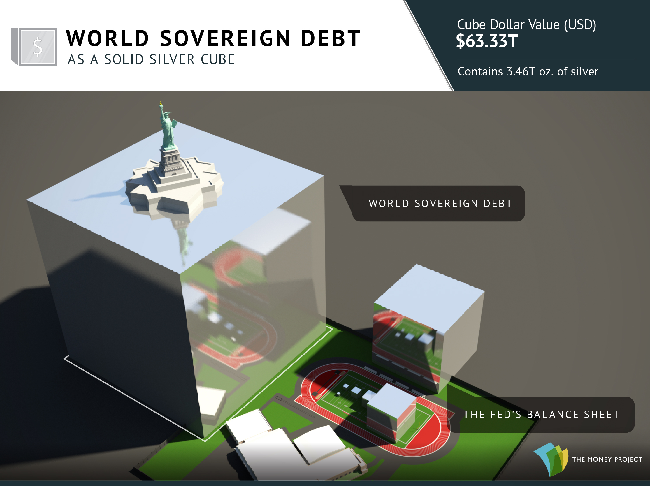
Numbers represented in the data visualization range from the size of the above-ground silver market ($17 billion) to the notional value of all derivatives ($1.2 quadrillion as a high-end estimate). In between those two extremes, we’ve added many other familiar measures, such as the GDP of California, the value of equities, the real estate market, along with different money supply metrics to give perspective.

The end result? A visually pleasing, but enlightening new way to understand the vast universe of global assets.

To get “All the World’s Money” in book or poster form, go to the Kickstarter page now. Deadline: Oct. 31, 2017

About the Money Project

The Money Project uses intuitive visualizations to explore ideas around the very concept of money itself. Founded in 2015 by Visual Capitalist and Texas Precious Metals, the Money Project will look at the evolving nature of money, and will try to answer the difficult questions that prevent us from truly understanding the role that money plays in finance, investments, and accumulating wealth.

Presented by:

Also From The Money Project:

What is Money?

The World's Most Famous Case of Hyperinflation

Embed This Image On Your Site (copy code below):

Presented by: Texas Precious Metals

Although gold has a bigger reputation today as a monetary metal, it was often deemed too valuable for everyday transactions throughout history.

For the most part, common people in places like Ancient Rome used silver to buy daily staples like grain or wine. As a result, silver has a strong reputation through monetary history as the “people’s money”.

Even today, silver is still much more widely accessible. With one ounce of gold being 70x more expensive than an ounce of silver, it’s difficult for someone who is just starting to accumulate wealth to own gold.

Visualizing Silver

What do savings and debt look like, using the “people’s money”?

Below is everything from the average paycheck to global sovereign debt visualized as silver cubes.

1. A median U.S. family brings in $2,355 per pay period (semi-monthly) pre-tax.

Average U.S. Paycheck as a Silver Cube

2. However, the median American family only has about $5,000 of savings.

Median U.S. Savings as a Silver Cube

3. The standard silver delivery bar holds 1,000 oz of silver.

Silver bar

4. Average household debt is $98,312, with mortgage debt being the primary component.

Average household debt as a silver cube

5. A Lamborghini worth over $400,000 needs a silver cube with 16-inch (0.4m) sides.

A Lamborghini's value as a silver cube

6. Using a silver price of about $18/oz, here’s what $1 million looks like.

$1 million as a silver cube

7. Every day, the world’s mines produce about 75 tonnes of silver, worth over $44 million.

Daily Silver Production as a silver cube

8. Silver Eagle sales have jumped considerably since the Financial Crisis.

Silver Eagle Sales as a Silver Cube

9. When the Hunt Brothers tried to corner the silver market, they hoarded 200 million oz.

Hunt Brothers Stockpile as a Silver Cube

10. Today, almost 900 million oz of silver is mined each year.

All Silver Mined Each Year as a Silver Cube

11. JP Morgan’s market capitalization, in comparison to previous cubes.

JPMorgan's market capitalization as a silver cube

12. All silver ever mined would not compare to the Fed’s balance sheet, which is now $4.5 trillion.

All Global Debt Visualized as a Gold Cube

13. Global sovereign debt is 13X bigger than all previous cubes combined.

All Sovereign Debt Visualized as a Gold Cube

Liked our visualizations of silver cubes?

Don’t forget to check out 11 stunning visualizations of gold.

The Money Project is an ongoing collaboration between Visual Capitalist and Texas Precious Metals that seeks to use intuitive visualizations to explore the origins, nature, and use of money.

Get a free Beginner's Guide to Buying Precious Metals

Presented by: Texas Precious Metals


The Money Project is an ongoing collaboration between Visual Capitalist and Texas Precious Metals that seeks to use intuitive visualizations to explore the origins, nature, and use of money.

Only a few days after Trump’s inauguration ceremony, the U.S. National Debt will creep across the important psychological barrier of $20 trillion.

It’s a problem that’s been passed down to him, but it certainly puts the incoming administration in a difficult place. The debt is burdensome by pretty much any metric, and the rate of borrowing has exceeded economic growth pretty much since the late 1970s.

How Trump deals with this escalating constraint will be a deciding factor in whether his administration crashes and burns – or ends up re-positioning America for greatness.

Donald Trump’s $20 Trillion Problem

Partisans will squabble about who added what to the mounting debt, but the reality is that none of that really matters. Both parties have kicked the can down the road for the last 40 years, and that has culminated in the current situation:
Debt incurred under each President

Back in 1979, the debt-to-GDP ratio was a modest 31.8%, and the federal government only had an outstanding tab of $826 billion. Fast forward to today, and the perpetual borrowing has added up.

The debt-to-GDP is now 104.2%, with the total debt burden nearing the $20 trillion mark.

US government debt to GDP

In absolute terms, the debt is the highest it has ever been. Using the common measure of debt-to-GDP, the debt is the highest it’s been in 70 years. The last time it soared past the 100% mark was during the final year of WWII.

Granted, the situation isn’t as bad as Greece, Cyprus, or Japan – but it’s getting there:

Debt to GDP

In terms of debt-to-revenue, a measure that compares the national debt to the amount of taxes taken in by the federal government, the U.S. has the 2nd highest debt out of 34 OECD countries:

Debt to Revenue

On a “per person” basis, each person in the U.S. owes $61,300 – the second highest in the world. Per taxpayer, however, that amount balloons to $167,000.

Changing Rhetoric

So what does Trump think of all this debt business? It’s hard to say, because his rhetoric has changed.

At the start of his campaign, he made it clear that debt would be a top issue for his administration. In February 2016, Trump said that the U.S. was becoming a “large-scale version of Greece” and that tackling the debt would be “easy” with a more dynamic economy. In April 2016, he said he could pay off the debt after eight years in office.

This rhetoric aligns with the official GOP platform, which says that the national debt has “placed a significant burden on future generations”, calling for a “strong economy” and “spending restraint” to pay it down.

But since then, Trump’s views may have changed.

His most recent economic plans include $1 trillion in infrastructure and $5 trillion in tax cuts – and they could increase debt by anywhere from $5.3 to $11.5 trillion. He’s also said that the U.S. will never have to default because it can simply “print money”.

How Trump will choose to deal with the debt is a big question – and only time will tell if his actions will make America great again.

About the Money Project

The Money Project aims to use intuitive visualizations to explore ideas around the very concept of money itself. Founded in 2015 by Visual Capitalist and Texas Precious Metals, the Money Project will look at the evolving nature of money, and will try to answer the difficult questions that prevent us from truly understanding the role that money plays in finance, investments, and accumulating wealth.

The Money Project is an ongoing collaboration between Visual Capitalist and Texas Precious Metals that seeks to use intuitive visualizations to explore the origins, nature, and use of money.

How Much Money Have Humans Created?

The dollar amounts are so staggering, that simply telling you how much money humans have created probably wouldn’t convey the magnitude.

However, by using data visualization in this video, we can relate numbers in the millions, billions, and trillions to create the context to make it more understandable.

Starting With Context

The median U.S. household income of $54,000 is a number that most people can relate to. It’s enough money to save up to buy a car, or maybe even a house depending on where you live.

Multiply that income by eight, and that number is now big enough to count as being in the top 1% of earners. People in the “one percent” make at least $430,000 per year.

Famous celebrities and businesspeople have fortunes that dwarf those of many “one percenters”. Actor George Clooney, for example, has a net worth of $180 million. Meanwhile, author J.K. Rowling is estimated to have a net worth of roughly $1 billion according to Forbes.

Zuckerberg takes things to a whole new level. His net worth worth is $53 billion, thanks to the value of Facebook stock. Lastly, Bill Gates regularly tops the “richest people” lists with a wealth of $75 billion – though lately that number has been a little higher based on stock fluctuations.

However, even the wealth of the richest human on Earth is not enough to get up to our unit of measurement that we use in the video: each square is equal to $100 billion.

The World’s Money

Some of the world’s biggest companies take up just a few squares with our unit of measurement. ExxonMobil for example has a market capitalization of about $350 billion, and the world’s largest public company by market capitalization, Apple, is at about $600 billion.

The total of the world’s physical currency – all coins and bills denominated in dollars, euros, yen, and other currencies – is about $5 trillion.

Meanwhile, if we add checking accounts to the equation, the number for the amount of money in the world goes up to $28.6 trillion according to the CIA World Factbook. This is called “narrow money”.

Add all money market, savings, and time deposits, and the number jumps up to $80.9 trillion – or “broad money”.

But that’s nothing compared to the world of Wall Street.

Wall Street

All stock markets added together are worth $70 trillion, and global debt is $199 trillion.

That’s all impressive, but the derivatives market takes the cake. Derivatives are contracts between parties that derive value from the performance of underlying assets, indices, or entities. On the low end, the notional value of the derivatives market is estimated to be a whopping $630 trillion according to the Bank of International Settlements.

However, that only accounts for OTC (over-the-counter) derivatives, and the truth is that no one actually knows the size of the derivatives market. It’s been estimated by some that it could be as high as $1.2 quadrillion, and others estimate it could be even higher.

There are many financial critics who worry about the risk that these contracts pile onto the global financial system. With the sheer size of the derivative market dwarfing all others, it’s understandable why business mogul Warren Buffett has called derivatives “financial weapons of mass destruction”.

About the Money Project

The Money Project aims to use intuitive visualizations to explore ideas around the very concept of money itself. Founded in 2015 by Visual Capitalist and Texas Precious Metals, the Money Project will look at the evolving nature of money, and will try to answer the difficult questions that prevent us from truly understanding the role that money plays in finance, investments, and accumulating wealth.

Presented by: Texas Precious Metals

Visualizing the Size of the U.S. National Debt

Visualizing the Size of the U.S. National Debt

The Money Project is an ongoing collaboration between Visual Capitalist and Texas Precious Metals that seeks to use intuitive visualizations to explore the origins, nature, and use of money.

When numbers get into the billions or trillions, they start to lose context.

The U.S. national debt is one of those numbers. It currently sits at $19.5 trillion, which is actually such a large number that it is truly difficult for the average person to comprehend.

How big is the U.S. National Debt?

The best way to understand these large numbers? We believe it is to represent them visually, by plotting the data with comparable numbers that are easier to grasp.

Today’s data visualization plots the U.S. National Debt against everything from the assets managed by the world’s largest money managers, to the annual value of gold production.

1. The U.S. national debt is larger than the 500 largest public companies in America.
The S&P 500 is a stock market index that tracks the value of the 500 largest U.S. companies by market capitalization. It includes giant companies like Apple, Exxon Mobil, Microsoft, Alphabet, Facebook, Johnson & Johnson, and many others. In summer of 2016, the value of all of these 500 companies together added to $19.1 trillion – just short of the debt total.

2. The U.S. national debt is larger than all assets managed by the world’s top seven money managers.
The world’s largest money managers – companies like Blackrock, Vanguard, or Fidelity – manage trillions of investor assets in stocks, bonds, mutual funds, ETFs, and more. However, if we take the top seven of these companies and add all of their assets under management (AUM) together, it adds up to only $18.9 trillion.

3. The U.S. national debt is 25x larger than all global oil exports in 2015.
Yes, countries such as Saudi Arabia, Kuwait, and Russia make a killing off of selling their oil around the world. However, the numbers behind these exports are paltry in comparison to the debt. For example, you’d need the Saudis to donate the next 146 years of revenue from their oil exports to fully pay down the debt.

4. The U.S. national debt is 155x larger than all gold mined globally in a year.
Gold has symbolized money and wealth for a long time – but even the world’s annual production of roughly 3,000 tonnes (96 million oz) of the yellow metal barely puts a dent in the debt total. At market prices today, you’d need to somehow mine 155 years worth of gold at today’s rate to equal the debt.

5. In fact, the national debt is larger than all of the world’s physical currency, gold, silver, and bitcoin combined.
That’s right, if you rounded up every single dollar, euro, yen, pound, yuan, and any other global physical currency note or coin in existence, it only amounts to a measly $5 trillion. Adding the world’s physical gold ($7.7 trillion), silver ($20 billion), and cryptocurrencies ($11 billion) on top of that, you get to a total of $12.73 trillion. That’s equal to about 65% of the U.S. national debt.

Get a free Beginner's Guide to Buying Precious Metals

Embed This Image On Your Site (copy code below):