All of the World's Money and Markets in One Visualization (2017 Update)

All of the World’s Money and Markets in One Visualization

Enjoy this graphic? You can also find it in our new infographic book – it’s available until Oct 31st, 2017 on Kickstarter.

Millions, billions, and trillions…

When we talk about the giant size of Apple, the fortune of Warren Buffett, or the massive amount of global debt accumulated – all of these things sound large, but they are actually extremely different in magnitude.

That’s why visualizing things spatially can give us a better perspective on money and markets.

How Much Money Exists?

This infographic was initially created to show how much money exists in its different forms. For example, to highlight how much physical cash there is in comparison to broader measures of money which include saving and checking account deposits.

Interestingly, what is considered “money” depends on who you are asking.

Are the abstractions created by Central Banks really money? What about gold, bitcoins, or other hard assets?

A New Meaning

However, since we first released this infographic in 2015, “All the World’s Money and Markets” has taken on a different meaning to us and many others. It’s a way of simplifying a complex universe of currencies, assets, and other financial instruments in a way that people can understand.

Numbers represented in the data visualization range from the size of the above-ground silver market ($17 billion) to the notional value of all derivatives ($1.2 quadrillion as a high-end estimate). In between those two extremes, we’ve added many other familiar measures, such as the GDP of California, the value of equities, the real estate market, along with different money supply metrics to give perspective.

The end result? A visually pleasing, but enlightening new way to understand the vast universe of global assets.

To get “All the World’s Money” in book or poster form, go to the Kickstarter page now. Deadline: Oct. 31, 2017

About the Money Project

The Money Project uses intuitive visualizations to explore ideas around the very concept of money itself. Founded in 2015 by Visual Capitalist and Texas Precious Metals, the Money Project will look at the evolving nature of money, and will try to answer the difficult questions that prevent us from truly understanding the role that money plays in finance, investments, and accumulating wealth.

Presented by:

Also From The Money Project:

What is Money?

The World's Most Famous Case of Hyperinflation

Embed This Image On Your Site (copy code below):

Presented by: Texas Precious Metals

The Buying Power of the U.S. Dollar Over the Last Century

The Buying Power of the U.S. Dollar Over the Last Century

The Money Project is an ongoing collaboration between Visual Capitalist and Texas Precious Metals that seeks to use intuitive visualizations to explore the origins, nature, and use of money.

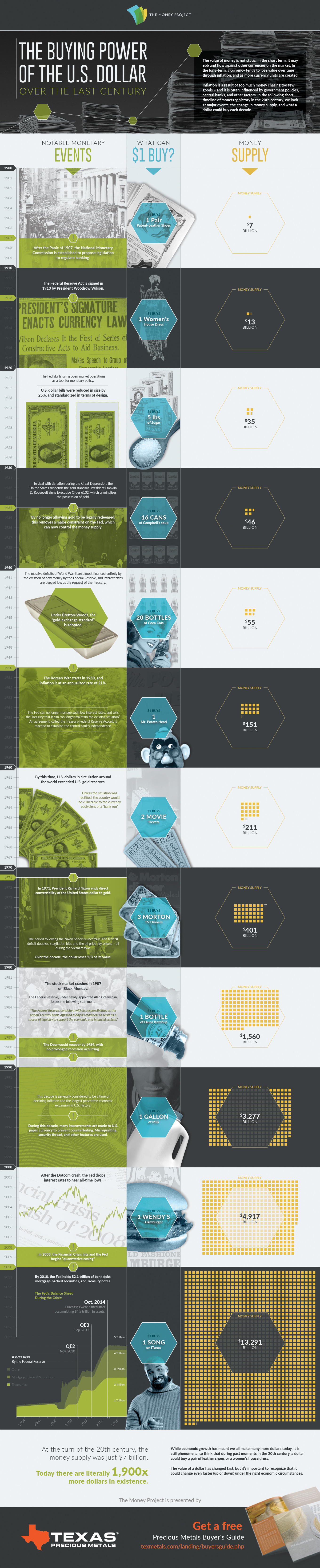
The value of money is not static. In the short term, it may ebb and flow against other currencies on the market. In the long-term, a currency tends to lose buying power over time through inflation, and as more currency units are created.

Inflation is a result of too much money chasing too few goods – and it is often influenced by government policies, central banks, and other factors. In this short timeline of monetary history in the 20th century, we look at major events, the change in money supply, and the buying power of the U.S. dollar in each decade.

A Short Timeline of U.S. Monetary History

1900s
After the Panic of 1907, the National Monetary Commission is established to propose legislation to regulate banking.

U.S. Money Supply: $7 billion
What $1 Could Buy: A pair of patent leather shoes.

1910s
The Federal Reserve Act is signed in 1913 by President Woodrow Wilson.

U.S. Money Supply: $13 billion
What $1 Could Buy: A woman’s house dress.

1920s
U.S. dollar bills were reduced in size by 25%, and standardized in terms of design.

The Fed starts using open market operations as a tool for monetary policy.

U.S. Money Supply: $35 billion
What $1 Could Buy: Five pounds of sugar.

1930s
To deal with deflation during the Great Depression, the United States suspends the gold standard. President Franklin D. Roosevelt signs Executive Order 6102, which criminalizes the possession of gold.

By no longer allowing gold to be legally redeemed, this removes a major constraint on the Fed, which can now control the money supply.

U.S. Money Supply: $46 billion
What $1 Could Buy: 16 cans of Campbell’s Soup

1940s
The massive deficits of World War II are almost financed entirely by the creation of new money by the Federal Reserve.

Interest rates are pegged low at the request of the Treasury.

Under Bretton-Woods, the “gold-exchange standard” is adopted.

U.S. Money Supply: $55 billion
What $1 Could Buy: 20 bottles of Coca-Cola

1950s
The Korean War starts in 1950, and inflation is at an annualized rate of 21%.

The Fed can no longer manage such low interest rates, and tells the Treasury that it can “no longer maintain the existing situation”.

U.S. Money Supply: $151 billion
What $1 Could Buy: One Mr. Potato Head

1960s
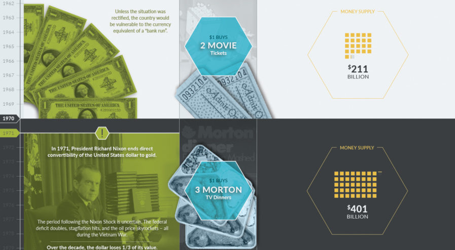
An agreement, called the Treasury-Federal Reserve Accord, is reached to establish the central bank’s independence.

By this time, U.S. dollars in circulation around the world exceeded U.S. gold reserves. Unless the situation was rectified, the country would be vulnerable to the currency equivalent of a “bank run”.

U.S. Money Supply: $211 billion
What $1 Could Buy: Two movie tickets.

1970s
In 1971, President Richard Nixon ends direct convertibility of the United States dollar to gold.

The period following the Nixon Shock is uncertain. The federal deficit doubles, stagflation hits, and the oil price skyrockets – all during the Vietnam War.

Over the decade, the dollar loses 1/3 of its value.

U.S. Money Supply: $401 billion
What $1 Could Buy: Three Morton TV dinners.

1980s
The stock market crashes in 1987 on Black Monday.

The Federal Reserve, under newly-appointed Alan Greenspan, issues the following statement:

“The Federal Reserve, consistent with its responsibilities as the nation’s central bank, affirmed today its readiness to serve as a source of liquidity to support the economic and financial system.”

The Dow would recover by 1989, with no prolonged recession occurring.

U.S. Money Supply: $1,560 billion
What $1 Could Buy: One bottle of Heinz Ketchup.

1990s
This decade is generally considered to be a time of declining inflation and the longest peacetime economic expansion in U.S. history.

During this decade, many improvements are made to U.S. paper currency to prevent counterfeiting. Microprinting, security thread, and other features are used.

U.S. Money Supply: $3,277 billion
What $1 Could Buy: One gallon of milk.

2000s
After the Dotcom crash, the Fed drops interest rates to near all-time lows.

In 2008, the Financial Crisis hits and the Fed begins “quantitative easing”. Later, this would be known as QE1.

U.S. Money Supply: $4,917 billion
What $1 Could Buy: One Wendy’s hamburger.

2010-
After QE1, the Fed holds $2.1 trillion of bank debt, mortgage-backed securities, and Treasury notes. Shortly after, QE2 starts.

In 2012, it’s time for QE3.

Purchases were halted in October 2014 after accumulating $4.5 trillion in assets.

U.S. Money Supply: $13,291 billion
What $1 Could Buy: One song from iTunes.

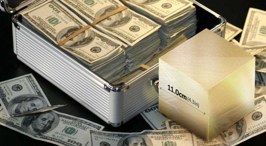
The Changing Value of a Dollar

At the turn of the 20th century, the money supply was just $7 billion. Today there are literally 1,900X more dollars in existence.

While economic growth has meant we all make many more dollars today, it is still phenomenal to think that during past moments in the 20th century, a dollar could buy a pair of leather shoes or a women’s house dress.

The buying power of a dollar has changed significantly over the last century, but it’s important to recognize that it could change even faster (up or down) under the right economic circumstances.

Get a free Beginner's Guide to Buying Precious Metals

Embed This Image On Your Site (copy code below):

Presented by: Texas Precious Metals

Since Ancient times, gold has served a very unique function in society.

Gold is extremely rare, impossible to create out of “thin air”, easily identifiable, malleable, and it does not tarnish. By nature of these properties, gold has been highly valued throughout history for every tiny ounce of weight. That’s why it’s been used by people for centuries as a monetary metal, a symbol of wealth, and a store of value.

Visualizing Gold’s Value and Rarity

With all that value coming from such a small package, sometimes it is hard to put gold’s immense worth into context.

The following 11 images help to capture this about gold, putting things into better perspective.

1. The U.S. median income, as a gold cube, easily fits in the palm of your hand.

U.S. Median Income as a Gold Cube

2. A gold cube worth $1 million, has sides that are 2/3 the length of a typical banknote.

One Million Dollars as a Gold Cube

3. All gold used for electrical connections in the Columbia Space Shuttle would be worth $1.6 million today.

All the Gold in the Columbia Space Shuttle in a Cube

4. Trump’s entire fortune of $3.7 billion as a gold cube would be shorter than Trump himself.

Donald Trump's fortune in a Gold Cube

5. As a gold cube, the entire value of the Bitcoin market would fit in a hallway.

The Bitcoin Market's Value as a Gold Cube

6. The fortune of the richest man on Earth, Bill Gates, would take up a single traffic lane.

Bill Gates' Wealth as a Gold Cube

7. The world’s entire annual production of gold is just a 5.5m sided (18 ft) cube.

Annual Gold Production a Gold Cube

8. Take the 147.3 million oz of gold out of Fort Knox, and it’s only slightly bigger.

All the Gold in Fort Knox Visualized as a Cube

9. All gold held by the Central Banks pales in comparison to the Brandenburg Gate.

The World's Central Banks Holdings as a Gold Cube

10. All gold mined in human history is dwarfed by the Statue of Liberty.

All Gold Mined in Human History Visualized as a Cube

11. To pay off $63 trillion of global sovereign debt, you’d need a gold cube the size of a building.

All Global Debt Visualized as a Gold Cube

Liked our visualizations of gold cubes? Check out this motion graphic video that shows how much money has been created by humans.

The Money Project is an ongoing collaboration between Visual Capitalist and Texas Precious Metals that seeks to use intuitive visualizations to explore the origins, nature, and use of money.

Get a free Beginner's Guide to Buying Precious Metals

Presented by: Texas Precious Metals

The World's Deepest Gold Mine

Descend Into The World’s Deepest Gold Mine

The Money Project is an ongoing collaboration between Visual Capitalist and Texas Precious Metals that seeks to use intuitive visualizations to explore the origins, nature, and use of money.

Humans will do almost anything for gold.

In fact, they will even suspend themselves 2.5 miles into the Earth – braving extreme temperatures, armed thieves, and constant seismic activity – just to mine a 30-inch gold reef.

Welcome to another day at Mponeng, the world’s deepest gold mine.

The Depths of the Witwatersrand

If you own any gold, there is about a 50% chance it comes from the Witwatersrand Basin in South Africa. Gold was first discovered there in 1886, and it is speculated that the discovery may have only been possible because of an asteroid impact. The Vredefort crater, the world’s largest impact crater at about 200 miles in diameter, is now 2.02 billion years old and potentially helped reveal the Witwatersrand gold outcrops.

The Mponeng gold mine, located west of Johannesburg and owned by AngloGold Ashanti, takes advantage of some of the deepest and richest areas of this deposit. Mponeng also represents the extent to which people are willing to go to take advantage of this region’s unparalleled mineral wealth.

Going Down…

Each day, roughly 4,000 miners take the plunge to get to the bottom of the mine. The journey includes taking the world’s tallest elevator, which hits a top speed at 40 mph, to make their way down.

That far into the Earth’s crust, conditions are intense. Rock walls in the Mponeng mine reach temperatures of 140°F (60°C) and humidity levels often exceed 95%. To keep things cool, the mine uses a novel cooling system to manage temperatures. Over 6,000 tonnes of ice slurry are pumped into underground reservoirs, and giant fans help to spread the air flow.

Every day, about 5,000 lbs of explosives are blasted in the mine, and 6,400 tonnes of rock are excavated.

Breaking New Ground

Gold production at the world’s deepest gold mine has been declining each year, so miners going even deeper to try and get gold.

The continued search for gold in Mponeng has led to scientific discoveries. A bacterium called Desulforudis audaxviator was found in groundwater – and it’s quite unique. The bacterium exists independently from the sun, using energy from natural radioactivity to create food. Some experts think that similar life forms could exist on other planets.

The wealth of the mine has also created an unusual crime problem. Armed, illegal miners called “ghost miners” descend into the mine for months at a time, which turns their skin pale due to a lack of sunlight. This has helped create an underground (pun intended!) marketplace, where legitimate miners profit from the ghost miners’ existence. They can sell a $1 loaf of bread for $12 underground, where it is in high demand.

Mission Accomplished

At the bottom of the world’s deepest gold mine, there is a 30-inch seam of gold called the Ventersdorp Contact Reef.

This is what the miners came for, but soon they will have to dig even deeper. In fact, plans are already in place to tap into neighboring gold reefs, which would extend the life of the mine beyond 2040.

Get a free Beginner's Guide to Buying Precious Metals

Embed This Image On Your Site (copy code below):

Presented by: Texas Precious Metals

Visualizing the Size of the U.S. National Debt

Visualizing the Size of the U.S. National Debt

The Money Project is an ongoing collaboration between Visual Capitalist and Texas Precious Metals that seeks to use intuitive visualizations to explore the origins, nature, and use of money.

When numbers get into the billions or trillions, they start to lose context.

The U.S. national debt is one of those numbers. It currently sits at $19.5 trillion, which is actually such a large number that it is truly difficult for the average person to comprehend.

How big is the U.S. National Debt?

The best way to understand these large numbers? We believe it is to represent them visually, by plotting the data with comparable numbers that are easier to grasp.

Today’s data visualization plots the U.S. National Debt against everything from the assets managed by the world’s largest money managers, to the annual value of gold production.

1. The U.S. national debt is larger than the 500 largest public companies in America.
The S&P 500 is a stock market index that tracks the value of the 500 largest U.S. companies by market capitalization. It includes giant companies like Apple, Exxon Mobil, Microsoft, Alphabet, Facebook, Johnson & Johnson, and many others. In summer of 2016, the value of all of these 500 companies together added to $19.1 trillion – just short of the debt total.

2. The U.S. national debt is larger than all assets managed by the world’s top seven money managers.
The world’s largest money managers – companies like Blackrock, Vanguard, or Fidelity – manage trillions of investor assets in stocks, bonds, mutual funds, ETFs, and more. However, if we take the top seven of these companies and add all of their assets under management (AUM) together, it adds up to only $18.9 trillion.

3. The U.S. national debt is 25x larger than all global oil exports in 2015.
Yes, countries such as Saudi Arabia, Kuwait, and Russia make a killing off of selling their oil around the world. However, the numbers behind these exports are paltry in comparison to the debt. For example, you’d need the Saudis to donate the next 146 years of revenue from their oil exports to fully pay down the debt.

4. The U.S. national debt is 155x larger than all gold mined globally in a year.
Gold has symbolized money and wealth for a long time – but even the world’s annual production of roughly 3,000 tonnes (96 million oz) of the yellow metal barely puts a dent in the debt total. At market prices today, you’d need to somehow mine 155 years worth of gold at today’s rate to equal the debt.

5. In fact, the national debt is larger than all of the world’s physical currency, gold, silver, and bitcoin combined.
That’s right, if you rounded up every single dollar, euro, yen, pound, yuan, and any other global physical currency note or coin in existence, it only amounts to a measly $5 trillion. Adding the world’s physical gold ($7.7 trillion), silver ($20 billion), and cryptocurrencies ($11 billion) on top of that, you get to a total of $12.73 trillion. That’s equal to about 65% of the U.S. national debt.

Get a free Beginner's Guide to Buying Precious Metals

Embed This Image On Your Site (copy code below):

It's Official: Bitcoin was the Top Performing Currency of 2015

It’s Official: Bitcoin was the Top Performing Currency of 2015

The Money Project is an ongoing collaboration between Visual Capitalist and Texas Precious Metals that seeks to use intuitive visualizations to explore the origins, nature, and use of money.

For most investors, the major story of 2015 was the expectation and eventual fulfillment of a rate hike, signalling the start of tightening monetary policy in the United States. This policy is divergent to those of other major central banks, and this has translated into considerable strength and momentum for the U.S. dollar.

Using the benchmark of the U.S. Dollar Index, a comparison against a basket of major currencies, the dollar gained 8.3% throughout the year.

Despite this strength, the best performing currency in 2015 was not the dollar. In fact, the top currency of 2015 is likely to be considered the furthest thing from the greenback.

Bitcoin, a digital and decentralized cryptocurrency, staged a late comeback in 2015 to overtake the dollar by a whopping 35% by the end of the year.

Bitcoin is no stranger to extremes. During the year it came into the mainstream in 2013, Bitcoin gained 5,429% to easily surpass all other currencies in gains. However, the following year it would become a dog, losing -56% of its value to become the world’s worst performing currency in 2014.

The second best performing major currency, relative to the USD, was the Israeli shekel. It gained 0.3% throughout the year, and the Japanese yen (0%) and Swiss franc (0%) were close behind, finishing on par with how they started the year.

The world’s worst performing currencies are from countries that were battered by commodities or geopolitical strife.

Ukraine’s hryvnia fell -33.8% in the aftermath of Crimea. Brazil’s real (-30.5%), the Canadian dollar (-15.9%), Russian ruble (-20.8%), and South African rand (-26.7%) all lost significant value in the purging of global commodities. Gold finished the year down -10%, and silver at -11%.

About the Money Project

The Money Project aims to use intuitive visualizations to explore ideas around the very concept of money itself. Founded in 2015 by Visual Capitalist and Texas Precious Metals, the Money Project will look at the evolving nature of money, and will try to answer the difficult questions that prevent us from truly understanding the role that money plays in finance, investments, and accumulating wealth.

Embed This Image On Your Site (copy code below):

All of the World's Money and Markets in One Visualization

All of the World’s Money and Markets in One Visualization

How much money exists in the world?

Strangely enough, there are multiple answers to this question, and the amount of money that exists changes depending on how we define it. The more abstract definition of money we use, the higher the number is.

In this data visualization of the world’s total money supply, we wanted to not only compare the different definitions of money, but to also show powerful context for this information. That’s why we’ve also added in recognizable benchmarks such as the wealth of the richest people in the world, the market capitalizations of the largest publicly-traded companies, the value of all stock markets, and the total of all global debt.

The end result is a hierarchy of information that ranges from some of the smallest markets (Bitcoin = $5 billion, Silver above-ground stock = $14 billion) to the world’s largest markets (Derivatives on a notional contract basis = somewhere in the range of $630 trillion to $1.2 quadrillion).

In between those benchmarks is the total of the world’s money, depending on how it is defined. This includes the global supply of all coinage and banknotes ($5 trillion), the above-ground gold supply ($7.8 trillion), the narrow money supply ($28.6 trillion), and the broad money supply ($80.9 trillion).

All figures are in the equivalent of US dollars.

About the Money Project

The Money Project acknowledges that the very concept of money itself is in flux – and it seeks to answer these questions.

The Money Project aims to use intuitive visualizations to explore ideas around the very concept of money itself. Founded in 2015 by Visual Capitalist and Texas Precious Metals, the Money Project will look at the evolving nature of money, and will try to answer the difficult questions that prevent us from truly understanding the role that money plays in finance, investments, and accumulating wealth.

Embed This Image On Your Site (copy code below):